Robohead UI Redesign
Roll : UX/UI Designer
Tools: Figma, Adobe illustrator, XD
Timeline: March 2025 - Current
RoboHead’s legacy platform was powerful but visually and structurally dated. Users reported that the interface felt cluttered and difficult to navigate, with inconsistent component styling and a lack of hierarchy that made it hard to locate key actions.
Some of the core UX challenges included:
Outdated visual hierarchy: Dense layouts and small, low-contrast text made scanning difficult.
Inefficient workflows: Users had to click through multiple layers of menus to find projects or task details.
Inconsistent UI elements: Buttons, form fields, and icons varied across different parts of the app, reducing familiarity and increasing cognitive load.
Limited responsiveness: The old interface did not adapt well to modern screen sizes or mobile devices.
Visual identity mismatch: The design no longer reflected RoboHead’s forward-thinking brand or competitive landscape.
These issues collectively created a learning curve for new users and slowed down daily task completion for power users — particularly in fast-paced marketing teams that relied on RoboHead for project tracking and approvals.
The Problem: The redesigned RoboHead platform delivers a more intuitive and cohesive experience for marketing and creative teams.
Key improvements include:
Streamlined dashboards: Simplified navigation and prioritization of key actions reduce time to insight and task completion.
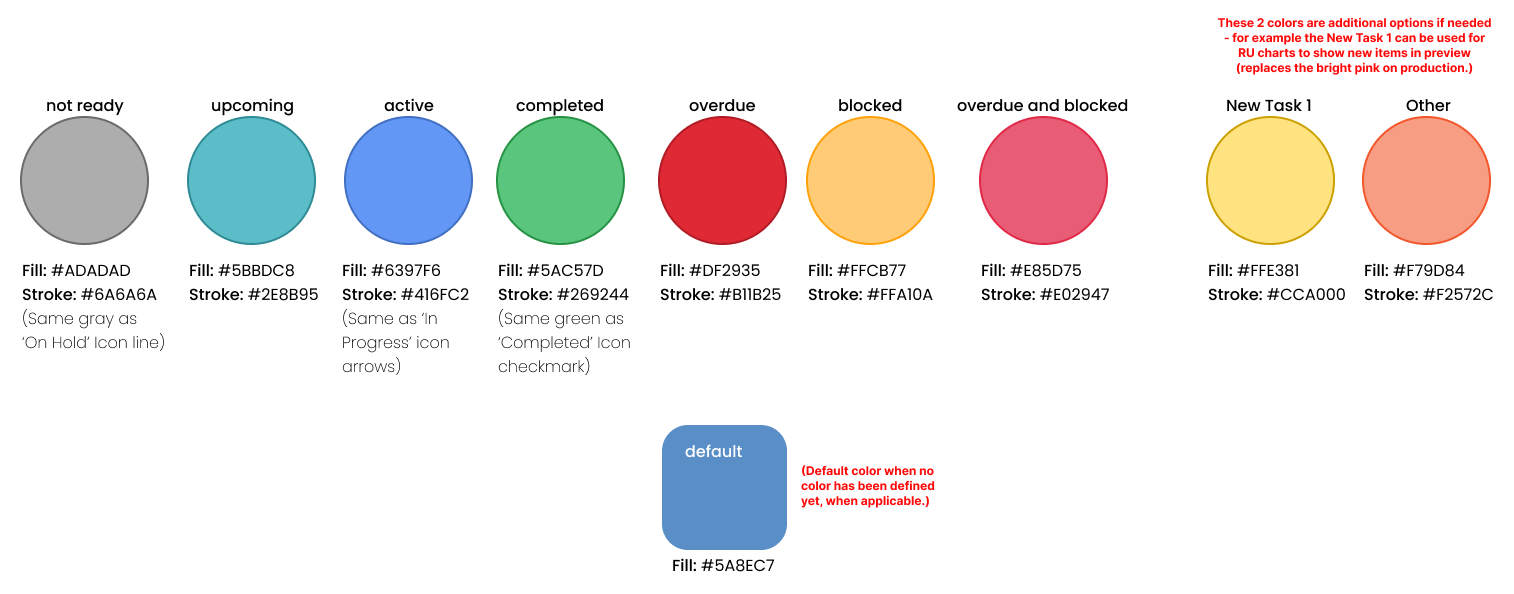
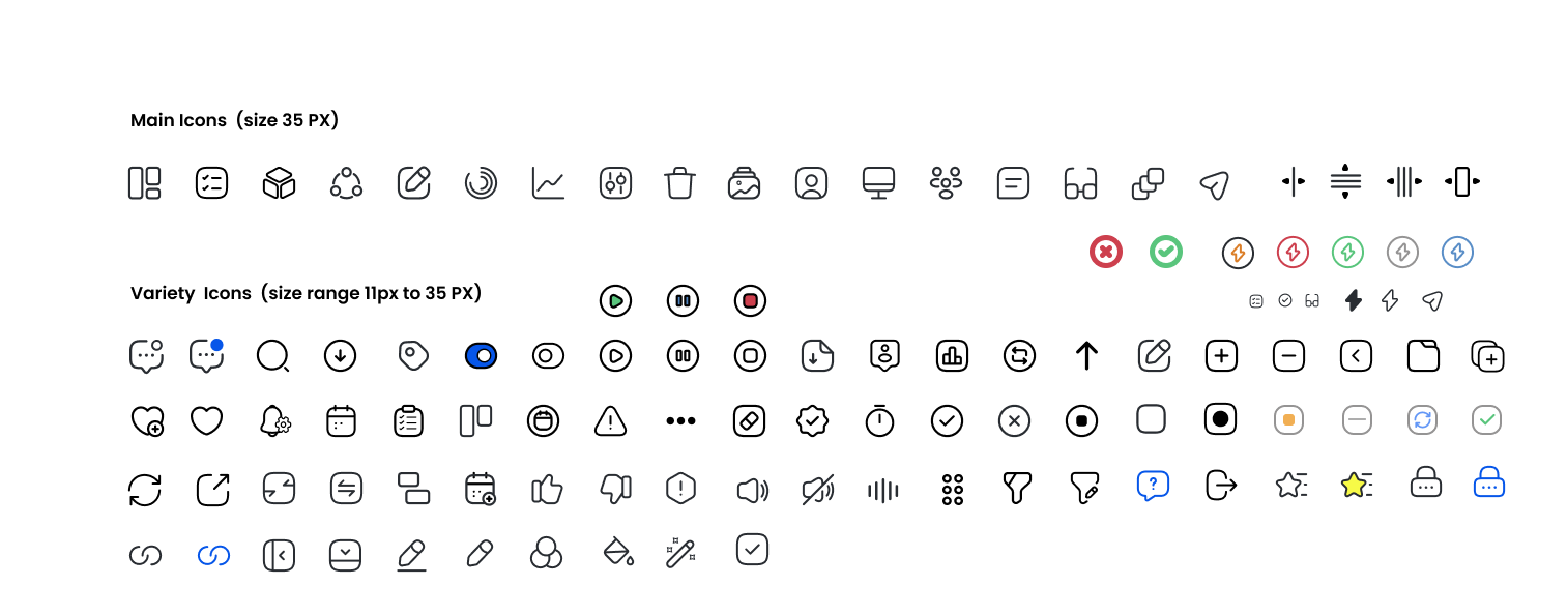
Unified component library: A single source of truth for all interface elements, improving consistency and speeding up new feature development.
Modern UI aesthetics: Updated typography, color palette, and component styling create a more engaging and professional interface.
Improved usability: Clearer affordances, responsive layouts, and accessibility enhancements increase overall satisfaction for diverse user types.
The Product: Previous Research and Competitor Analysis ReportsBefore initiating the redesign for RoboHead, I conducted a comprehensive competitor analysis based off of previously accumulated research, this allowed a better understand the landscape of modern project management and creative workflow tools. The goal was to identify industry standards, UX patterns, and visual trends that would help position RoboHead as a more intuitive and competitive platform
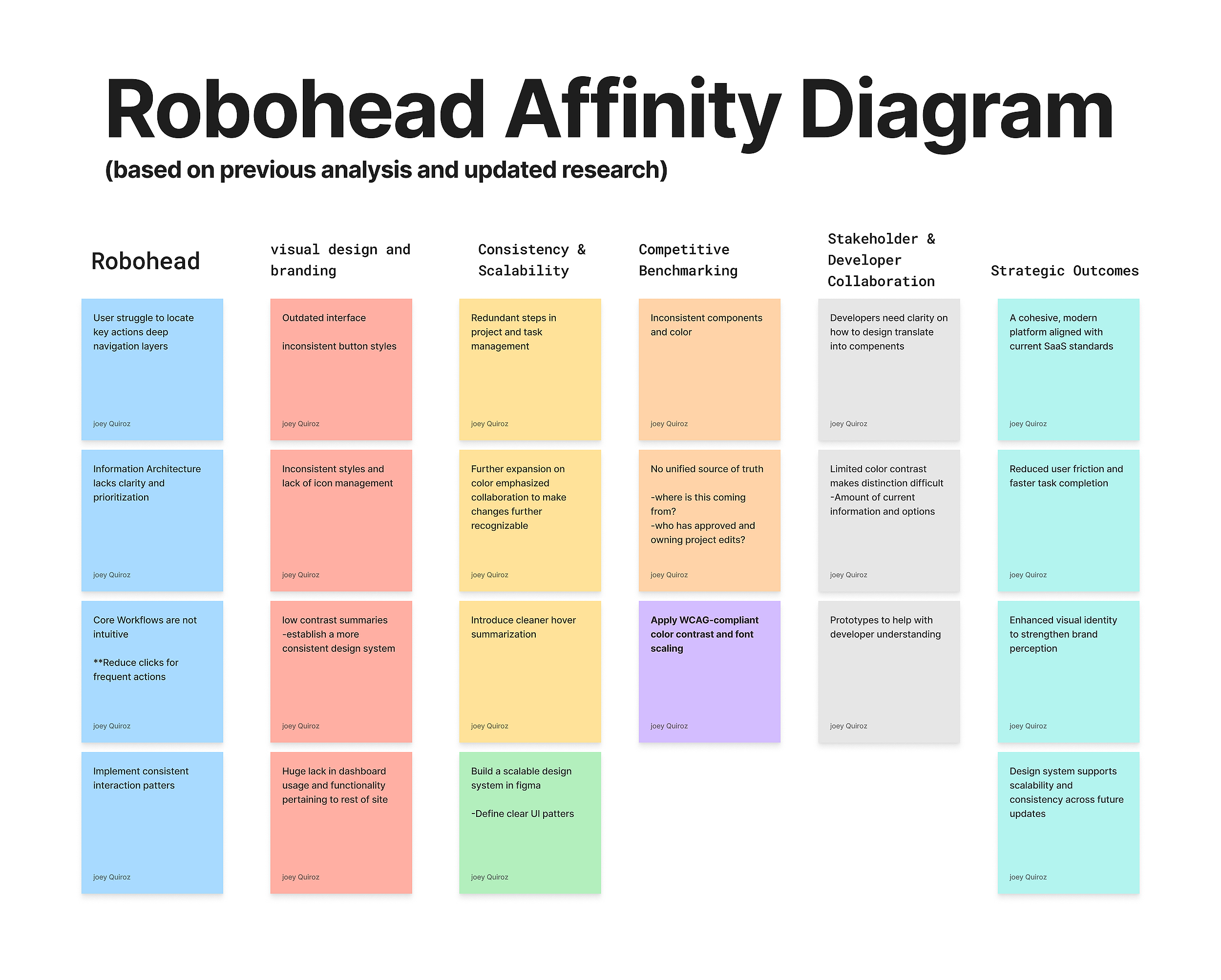
The research revealed that RoboHead’s interface was powerful but outdated — cluttered navigation, inconsistent UI components, and limited visual hierarchy made the user experience feel complex and overwhelming.
In contrast, modern competitors emphasized clean design systems, responsive layouts, and quick task visibility.
Using these insights, I:
Developed a unified design system in Figma to bring consistency across all modules.
Simplified navigation and task workflows to reduce friction and align with user mental models.
Refreshed the visual identity to reflect a modern, professional SaaS product.
The result was a streamlined, cohesive platform that improved usability and positioned RoboHead competitively in the project management space — setting the foundation for long-term scalability and development efficiency.
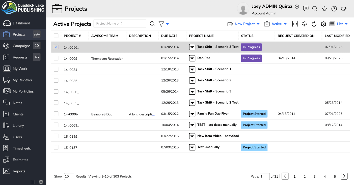
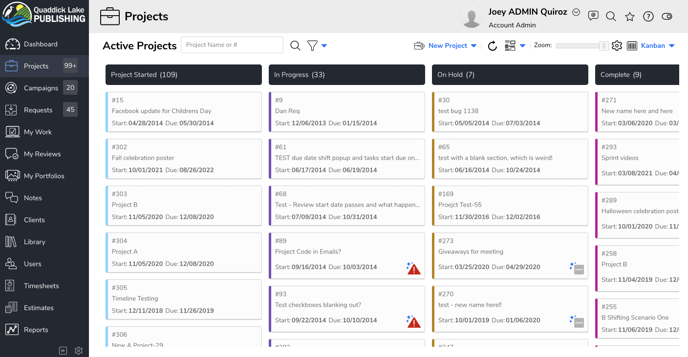
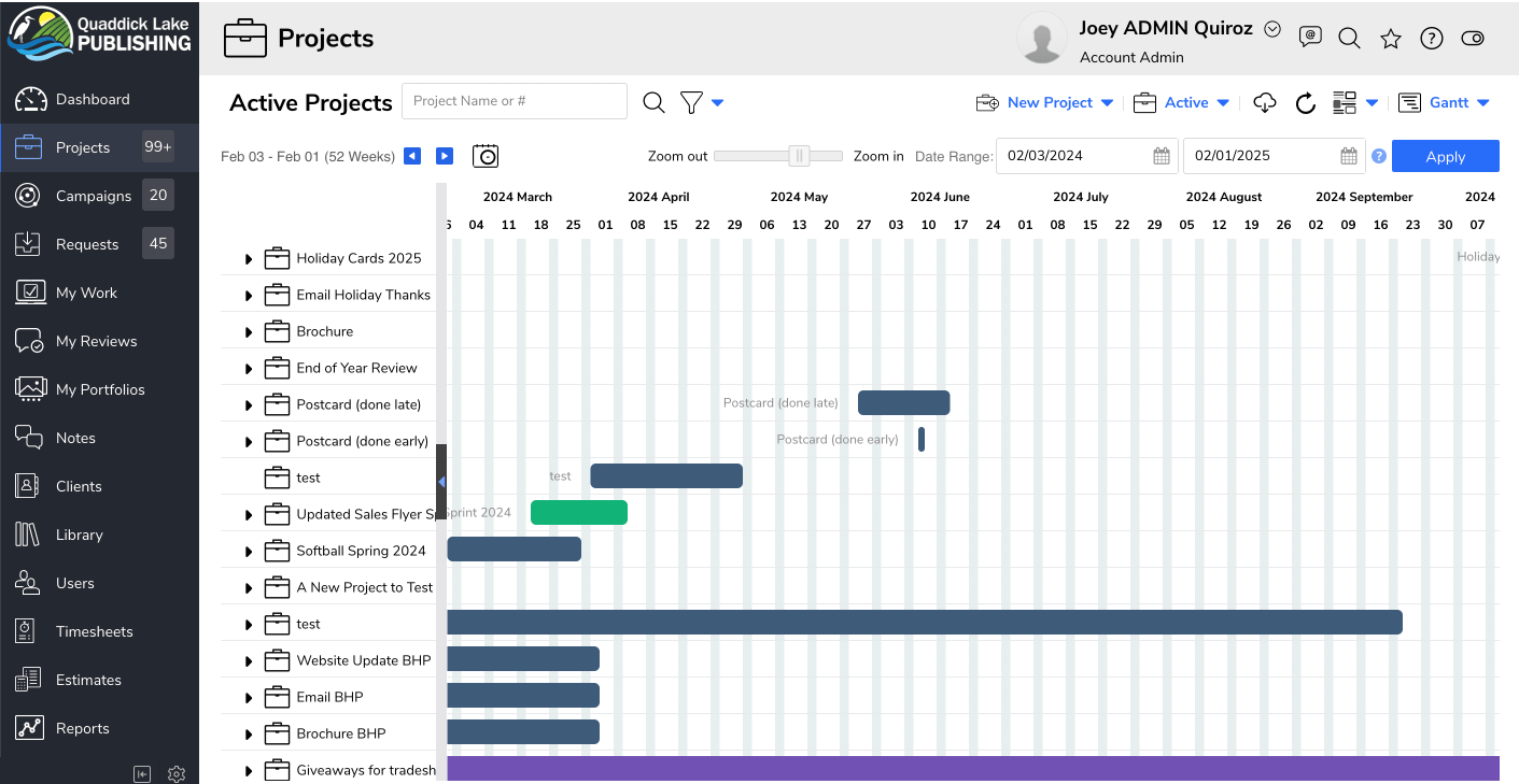
Platform RedesignThe redesign of the Projects List focused on modernizing RoboHead’s visual language, improving usability across high-density data tables, and creating a more intuitive workflow for creative and marketing teams. The updates addressed major pain points from the legacy interface and introduced a cleaner, more accessible experience
Modernized Visual Hierarchy
Before:
Dense, visually heavy table with limited spacing.
Status tags lacked contrast and didn't signal priority or state clearly.
Fonts and weights were inconsistent, making scanning difficult.
After:
Clear hierarchy using consistent type scale, weight, and spacing.
Refined status pills with stronger color contrast and semantic meanings (In Progress, In Review, On Hold, etc.).
Larger row height and cleaner alignment for improved scannability.
Simplified Navigation & Left Sidebar Redesign
Before:
Dark, bulky sidebar with outdated iconography.
Poor visual distinction between primary and secondary items.
Interface felt heavy and difficult to focus within.
After:
Light, minimal sidebar with modern custom icons.
Clearer active state indicators and improved category grouping.
Reduced cognitive load and a more welcoming, modern look.
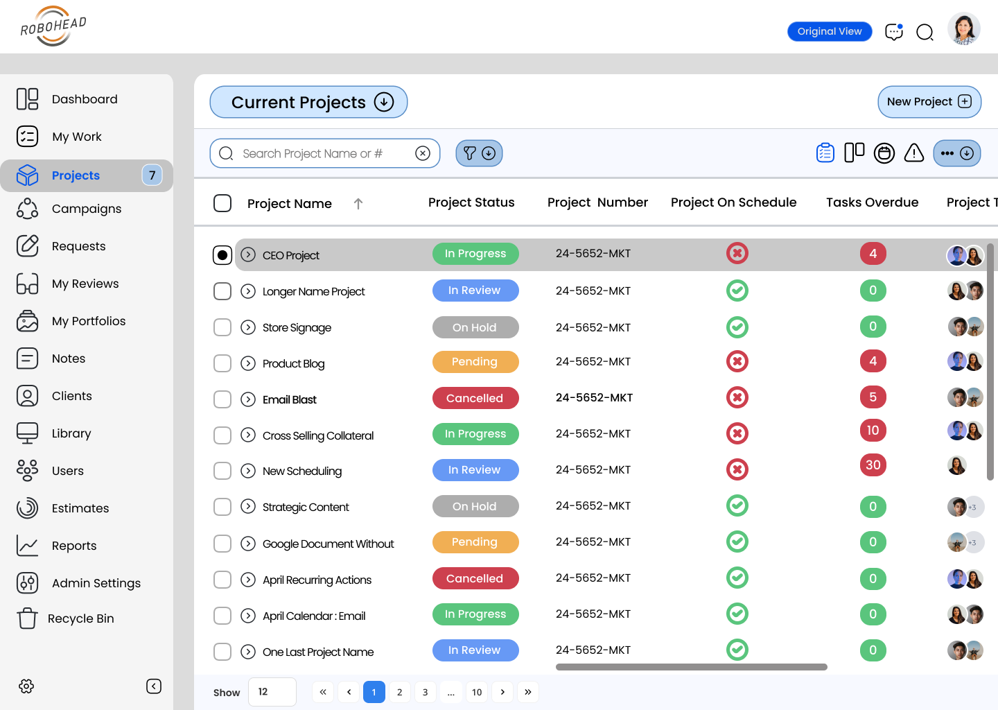
Improved Table Structure & Data Density
Before:
Columns were tightly packed, making the content feel cramped.
Status and metadata were difficult to scan quickly.
Pagination was minimal and visually outdated.
After:
Optimized column spacing and alignment to enhance readability.
Stronger row contrast and hover states for easier tracking.
Redesigned pagination with modern UI patterns and larger tap targets.

Overall Impact
The redesign transformed RoboHead’s Projects List from a dated, visually noisy interface into a modern, modular system aligned with current SaaS design standards. The result is a cleaner, more accessible, and more efficient workflow for users managing complex project environments.
This upgrade also laid the foundation for the new RoboHead design system, enabling scalable future development, consistent UI patterns, and smoother designer → developer handoff.
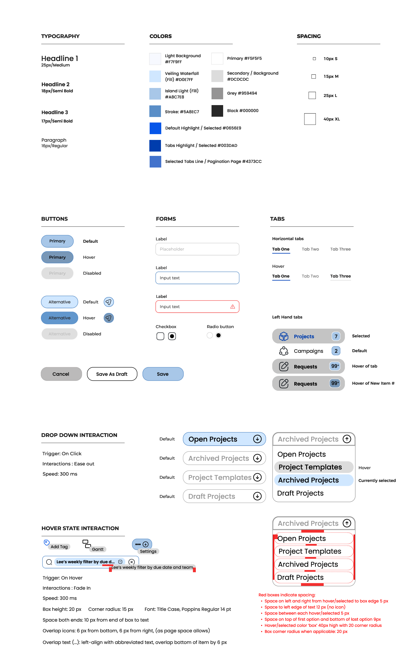
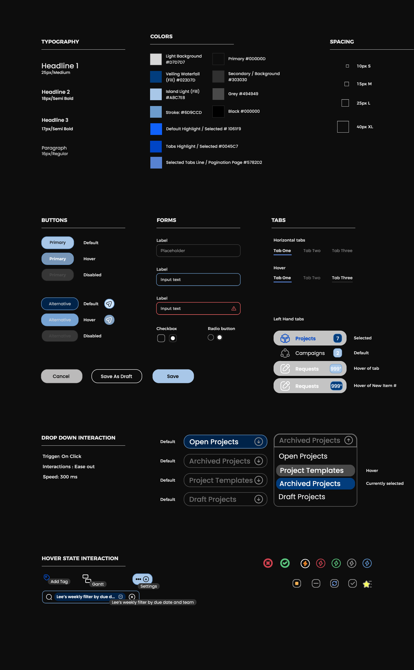
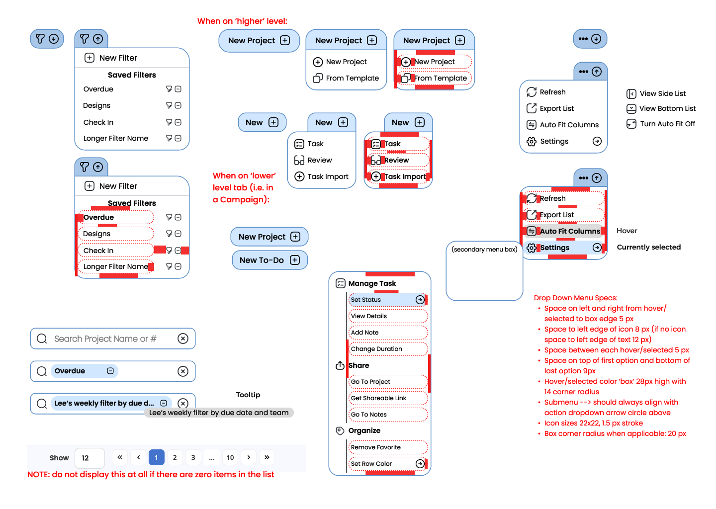
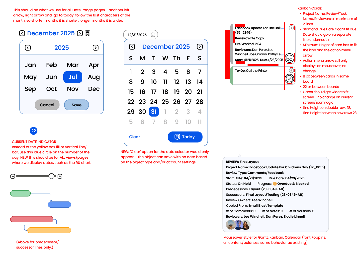
Design System
The RoboHead design system was developed to modernize the platform’s interface and bring consistency across its complex project management environment. Built in Figma, it established a unified set of typography, color, spacing, and interaction standards that aligned the product’s visual language with modern SaaS design principles and improved developer handoff efficiency.